
By end you will have learnt the following:
- How 2D digital graphics fulfil their purpose.
- Graphic products and platforms.
- aesthetics of different styles used for different purpose.
- Characteristics of vector graphics.
- Characteristics of bitmap graphics.
- Different software appropriate to different applications.
- Technical characteristics required for different applications.

Purposes of a 2D graphic:
One purposes of 2D graphics is to represent a real word object in a computer image. For example on a smartphone all the applications would look like the real world object they are trying to “mimic”. 2D graphics serves for multiple purposes like, advertising, learning, entertainment, printing, etc. To understand about these graphics purposes,aesthetics of different styles, software appropriate to different applications and technical characteristics required for different applications please select the links below:
- A design that makes digital applications look and mimic their real life counterpart is Skeuomorphic Design
- A design that also does the same as a Skeuomorphic Design however without the illusion of it looking realistic(3D looking) is Flat design
- A design that looks just like that which was made in the 70s, 80s or 90s and usually used for entertainment is Vintage/Retro Design
- A design that uses mainly words is Typographic Design
- A design that is used to make illustrations on software or for paintings look like it was taken as a photo is Photo realistic illustration
- Using minimal amount of colors(mainly using basic colors) and space is called Minimal graphic style
- A really dirty and beaten up design would be a Grunge Design
- Using shapes to create a image is what a Geometric Design
Vector and Bitmap graphics

Vector graphics are constructed using mathematical formulas describing shapes, colors and placement. Instead of using a grid of pixels like bitmap graphics, a vector graphic consists of shapes, curves, line and text which together make a picture. While bitmap image contains information about the color of each pixel and vector graphic contains instructions about where to place each of the components.
Advantages of vector graphics:
- Data volume does not depend on the actual value of the object, which provides the possibility to use the minimum amount of the information to describe arbitrarily large objects wit files of minimum size.
- Because information about the object is stored in a narrative form, any particular element of the image could be scaled without quality loss (but if, for example, a curve is shown as a broken line, the scaling will reveal that it’s not actually a curve).
- The parameters of objects are stored and can be quickly changed. This also means tha the moving, scaling, rotating, etc. Does not degrade the picture quality, Moreover, generally, the dimensions are indicated in device-independent units, which leads to the best possible rasterization on raster devices.
- When increasing or decreasing an object, any of its line could be of a constant pre-specified width that is independent of the actual size of the depicted image.
Disadvantages of vector graphics:
- Not every graphics could be easily displayed in vector form: an original image may require a very large amount of complex descriptions that increases the volume of memory occupied
- As a rule, the converting of a raster image into vector one is much more complicated than the reverse process. It’s called raster tracing, and it requires considerable computing power and processor time. In addition, it does not always provide the high quality of the resulting vector drawing.
- The advantage of vector images disappears if the vector format is displayed if the vector format is displayed in raster resolution of extremely low resolution (e.g. 16×16).
Short comparison:
- In general, a bitmap graphic is much larger than a similar vector graphic.
- Bitmap graphics are affected by resolution. If you enlarge a bitmap graphic, it will look jagged however when shrunk its features become indistinct and fuzzy because the pixels are being expanded too and as they expand they become less sharp and then the image gets blurry and fuzzy this way. This won’t happen with vector graphics as their shapes are redrawn to compensate changes in resolution so no matter how much you enlarge the vector image it will still remain clear.However if you were to extremely zoom into a Vector image you could see some pixels since this is how devices project images and webpages.
- Altering vector graphics is easy because the shapes within them are able to ungroup then edited individually. However, vector graphics are difficult to modify or display when they are not opened in programs that understand their rendering languages.
A bitmap also known as “raster” graphic is created from rows of different colored pixels that together form an image. In their simplest form, bitmaps have only two colors, each pixel being either black or white. With increasing complexity, and image can include more colors; photograph-quality images may have millions. Which is already different to a Vector graphic as Vector graphics are constructed using mathematical formulas describing shapes, colors, and placements.
The number of colors used and color depth (these characteristics have the following relationship: N=2^k, where N is a number of colors, and k-color depth). The color model (RGB, CMYK, XYZ, etc.). Color depth is the color of bits show the color of a single pixel in a bitmap image like a .png image or for a video framebuffer or the number of bits used for each color of a single pixel. These are the different images with a different amount of color depths:

Image resolution- the value that defines the number of dots (raster image elements) per unit area (or per unit length). It also makes reference to the number of pixels on an image.
To summaries this the images that use small dots which are pixels is a raster/bitmap graphics and each of these pixels are assigned a color and when expanded the pixels in the image start to become less sharper as they are being forced to expand. However when using vector graphics the images are clear and remain straight by using mathematical formulae. This would mean that if the user wants to create a line that is unidentified it will create a line that it assumes will be good enough for the user.
Advantages of Bitmap graphics:
- Allows users to create any image, regardless of its complexity. In contrast, vector graphics can’t accurately convey the effect of the transition from one color to another without a loss in the file’s size.
- Used almost everywhere, (Not expensive)
- High processing speed: you’re managing quite fast with complex images if no scaling is needed.
- Best suits popular input-output devices, such as monitors, digital cameras, scanners, printers both inkjet and matrix, and cell phones.
Disadvantages of Bitmap graphics:
- Excessively large size of simple images
- Impossibility of perfect scaling
- The inability to print on a vector plotter.
The most common bitmap graphics are photos, scanned images, exported vector images, screenshots.
2D Graphics in products and Platforms
2D graphics can be seen in our everyday lives and they are mainly found on different media platforms and their products:
- Education is one platform and the products would be textbooks and flash cards. Both are used for educational purposes however the way they are used to presented to the person using them/reading them is different. When using flash cards they could mainly contain images with text/descriptions. The use of the images to look like how the audience could images what they may look like in real life. However the use of the basic looking font makes it obvious that the flash cards were possible made for children as the images are taking up most of the space on the flash card then there is a short text that gives some information. The use of the plain text and making the information given short could suggest that the flash cards are made for children who can identify object or people visually. However in a textbook it is seen that there is barely any use of images and mainly just text. The use of a basic font and only using bright colors to highlight certain topics could suggest the book may be used by Students or Young adults that are in year 11 or sixth form. As there is barely any images to prevent the reader from being bombarded with useless pictures they may not need to see as they may have already seen them in real life during their lives.


- Another platform will be in Film and its product will be Posters,Merchandise and DVD (covers) as an example will be the Coraline DVD case it also uses Some Typographics as the writing that is on the cover makes it look like a child has written it. It also has a button on the “O” to symbolise the plot of the movie. Another Product would be the Matrix movie it would rester image as it has a picture of the main cast and then it is being blended with vector designs with the code that is written around the main cast which is symbolising the plot of the movie and the dark spaces around them. While also making the title in the movie look futuristic using a ray of light and making the text share the same color as the code. The differences which is shown in the two movie covers is that Coraline’s look like it is trying to reach out to a younger audience possibly children which are at a reading age as the Font in the movie looks like is drawn by a child and is taking up a Good amount of space of the cover. However in the Matrix the font in the movies title also look like it is in bold but unlike Coraline’s cover the Matrix cover looks like it had its title done by a computer as all the characters are in capitals and doesn’t look like a child or any human has written it.


- Another platform would be in Video games and its product would be posters,Merchandise and Video game(covers). For example The Red Dead Redemption 2 game cover it has a retro type to it as it has a really red and orange and the type font looks really old like from the cowboy age when they made wanted posters and the writing looked extremely worn out it was also drawn by hand then it was painted over virtually. Another Video game cover would be Kingdom Hearts 3 The cover has gone the same process as the Red Dead Redemption 2 game cover. The purpose of The Red Dead Redemption 2 having a really retro look like it came from the 1800s was to catch the attention of the audience mainly those who were interested in these times as we can tell that the cover almost looks like a wanted poster with the type font looking the old wooden or iron press. The image with a possible outlaw in the back holding a pistol also looks like his image was hand illustrated just like the early 1800s where most images on wanted posters and newspapers were illustrated instead of taken photographically. In Kingdom Hearts The Text Font looks like it is a vector art as the letters all look straight and blend in with a heart logo in the back which represents the plot of the game. Kingdom hearts cover has the massive multi colored sky which would be seen as a bitmap/raster graphic as it has a wide variation of colors which would be used to catch the attention of those who have never played the game before. It also has illustrated main cast/ heroes of the game this is done to catch the attention of long term fans/players of the Kingdom Hearts Series and bring them back into it.


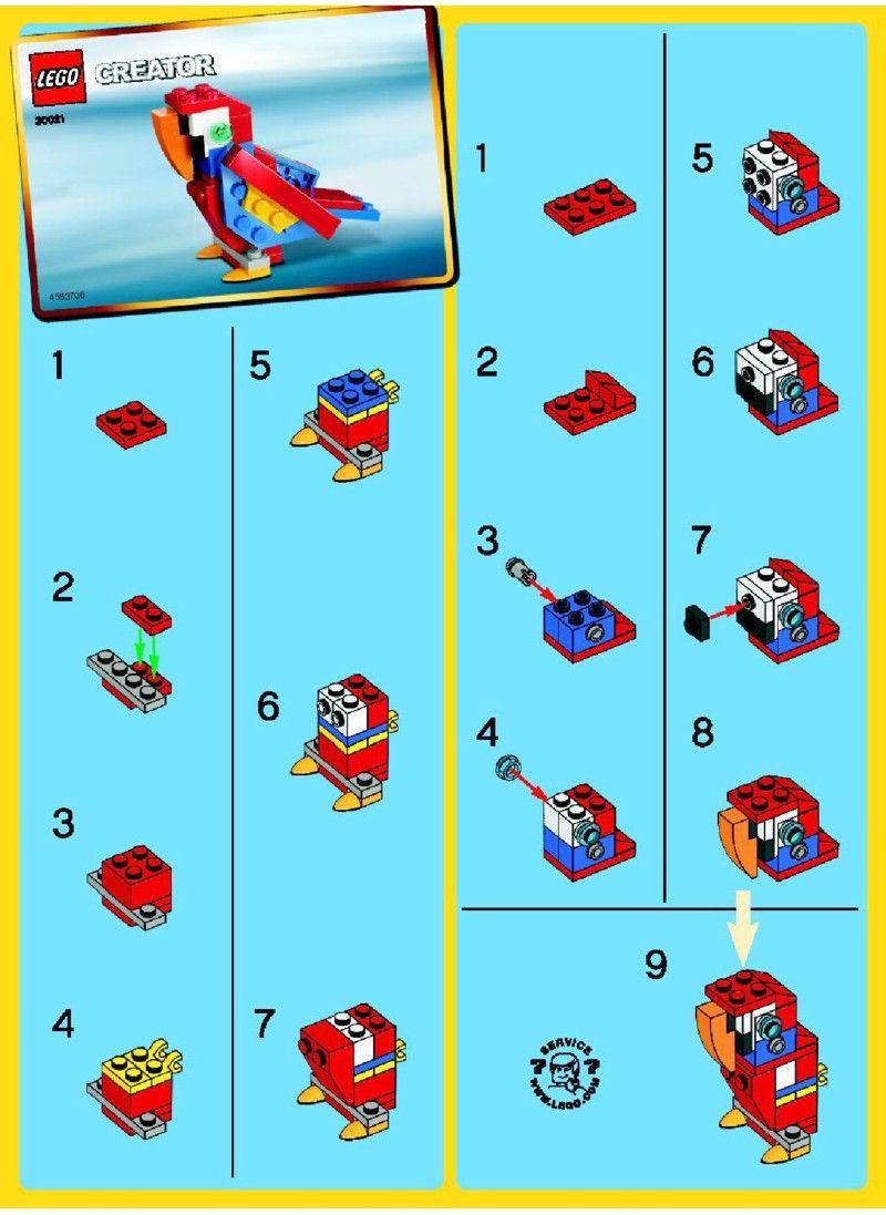
- Another platform would be printing and the product of this would be instruction manuals, one example of a company that gets their customers to use instruction manuals would be lego the way they only mainly use images already shows that this instruction manual is made for children as they do not use any text and only show images on what what bricks are needed and where will they go. Another Example is the Haynes instruction manuals they mainly use text in there instruction manuals and add in images if needed this shows that it is made for a mature audience that may be experienced in building the object/item/product as they barely make use of images and mainly uses text instead. One more example would be Ikea on how they mainly use images just like Lego however they don’t make use of colors at all and are seen to use only black and white images. Lego is making use of bright and basic colors that grabs the attention of the person creating the product and the lack of text/words shows that the they expect the audience to be children as having text with fancy fonts may confuse or bore the child that is creating the lego. However Haynes and Ikea do not do this as they are both printed in black and white and lack any color, however Haynes is seen to go into more detail with the products as they are seen to have added text to what they are saying they even use bold letters to highlight most of the important parts when building the product. They only use images when needed to so that the reader can understand what is needed to go where and what they may look like. Ikea uses the same method that Lego does when mainly using images for the readers to use however there is a lack of color in Ikea’s instruction/workshop manual which would mean that it allows the reader to easily read the manual without getting overwhelmed by colors. There is also some uses in text in the Ikea’s manual and they are typed in bold which would catch the reader’s attention when assembling the furniture they bought. They also use numbers which helps the reader understand what they are doing while building. These three companies use are using the same thing but use different methods to approach their audience as Lego is clearly made for children as they use variation of colors and they make what the reader is building look very simple without using words which could bore those that are reading. Haynes also makes it clear that they helping mature and experienced adults when creating the product, the lack of color and mainly use of text shows that they are reaching out to an audience which are experience when it comes to building these types of products . Ikea is also looking at a mature audience however they do not mainly focus using only words they mainly focus on using images and add a bit of side text to go with the image they even add numbers and measurements which would show their audience is adults or young adults assembling/building furniture.


- One last platform would be in escapism which product would be art and digital art/designs. Both art pieces are used as escapism which always those viewing the pieces to “escape” from the unpleasant stress from daily lifestyle they go through. It is also a source of entertainment made by others who may be handling with stress just like you and me.


Software used for different types of 2D graphics
For vector graphics design software that uses shapes and mathematical formulas to form lines would be needed. For example:
- Adobe Illustrator This uses simple shapes to create images. Most companies may use Adobe Illustrator to create their logos so they can be recognized. Then the style they are looking for is up to them for example, the google chrome logo could have been made using Adobe Illustrator using simple shapes and changing the colors.
- Another piece of software that can be used for vector graphics would be inkscape, inkscape has the same functions as Adobe Illustrator however one easy difference is that inkscape is free to use. This would suggest people who like to create different Graphics with styles like grunge as a hobby would be using this as it is free to use so anyone can use it. However the software being free may mean it lack some functions Adobe Illustrator uses.
For bitmap graphics design, a software that uses mainly pixels which can be altered or manipulated to edit digital images. A couple software used for bitmap graphics design are:
- Photoshop uses tools to alter or manipulate digital images. This is mainly used by professional designers, website professionals, video editors and photographers. Some platforms photoshop could be used for is websites as some of the images on the website could be edited through photoshop. Photoshop is also not an open-source(Free to use) as users have to pay for it. However students have a discount on paying for Adobe software.
- Another would be GIMP it is used in the same way as photoshop as it uses tools to alter or manipulate digital images. However unlike Photoshop this is an open-source application as it is free to use by anyone. This would also could be used for websites however it can also be used for photo editing for entertainment.
- In my opinion it would be better for those who are students and without much money to use open-source apps to help them with digital designs as they will still help with users become a god digital artist. There are some advantages to open-source as well as there is a sense of freedom and flexibility as the source code could be modified by the user who has downloaded and could be modified to help make the use of the software easier.
Technical characteristics/specifics required for different applications
There are mainly certain characteristics/specifics required for an image to be a certain file type. For example:
- Favicons they needs to be 16×16 pixels or 32×32 pixels using either 8-bit or 24 bit graphics. Favicons are mainly used for the logo on a website. It sometimes may have a small for version to be put in the tab bar, then a medium and or large version that would be used when a user actually clicks on the website. Favicons can be a vector graphic or bitmap graphic depending on the browser being used. For safari browser it will need to be a SVG file which is a file type for a vector graphic. However for Google it may be a bitmap graphic as it only supports bitmap graphic.
- The technical specifics required for an image to be a “.Jpeg”(Bitmap graphic) would be 65,535×65,535 pixels, meaning that there will be 4 gigapixels for an aspect ratio of 1:1. .Jpeg images can mainly be used to store images on a digital camera. Since it is able to support 2^24 or 16,777,216 colors, This would mean this is good for being used on a website as many devices may be able to render these pixels fast.
- PNG doesn’t have any technical specifics however it is mainly used to support/store web graphics, digital photographs and images with transparent backgrounds. It contains a bitmap of indexed colors and is compressed with lossless compression( Reduces a file’s size with no loss of quality.) similar to a .GIF file. This would mean photographers and journalists would use this type of file as it is easily portable as well via the internet.

